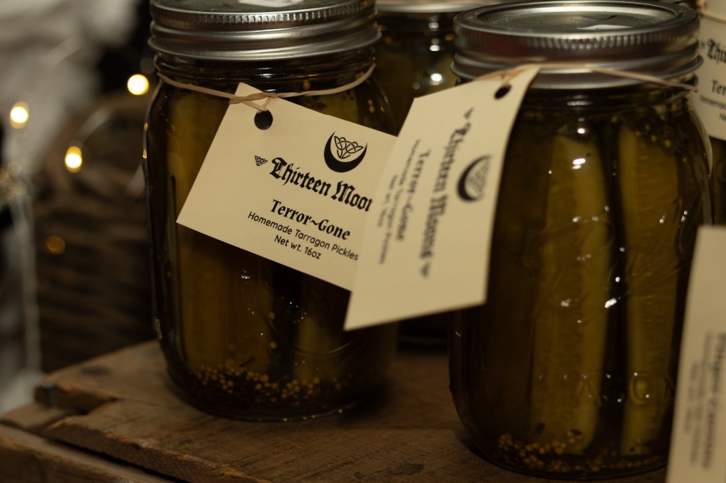
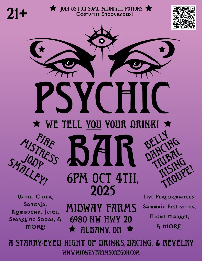
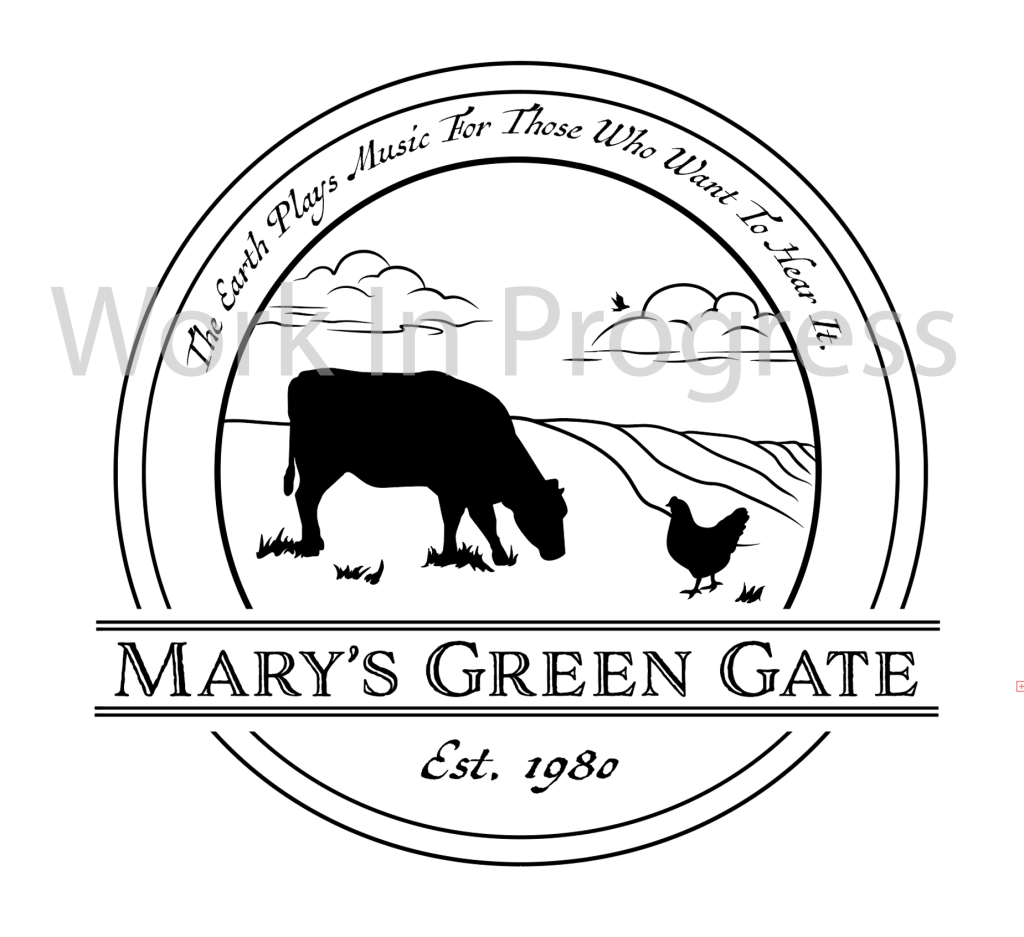
Graphic Design
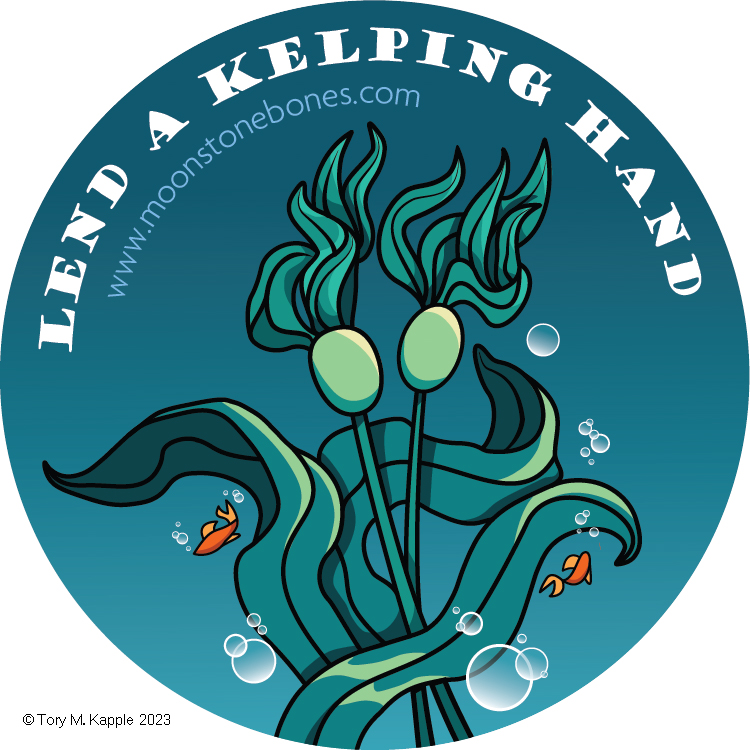
Need Show-Stopping Designs?
Whether you need a brand identity that expresses your values, a crowd-pleasing poster design, or a show-stopping logo, You’ve found the right place.
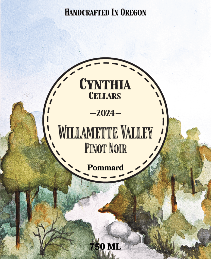
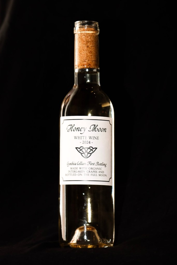
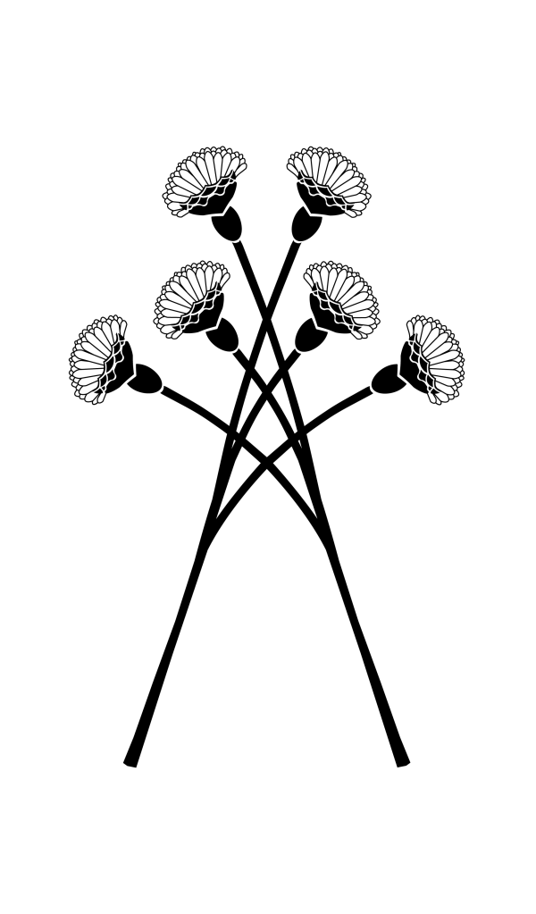
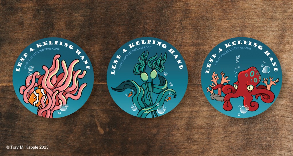
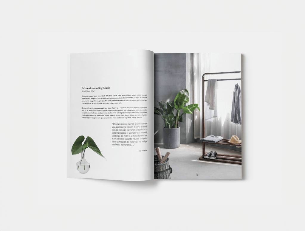
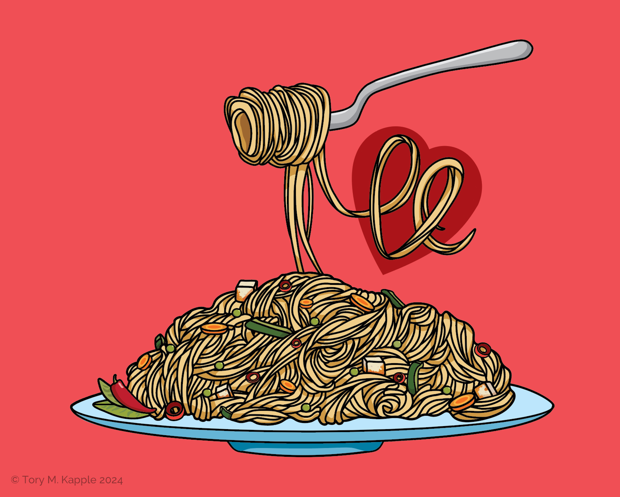
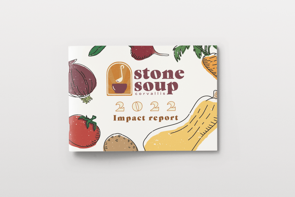
Latest Projects:

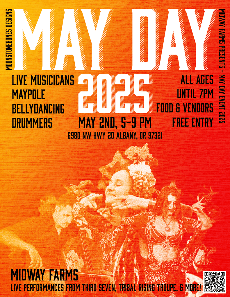
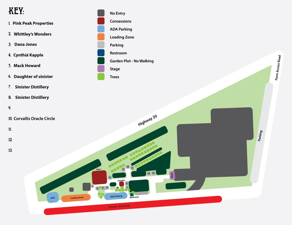
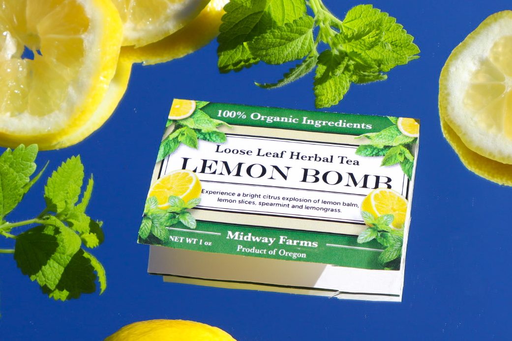
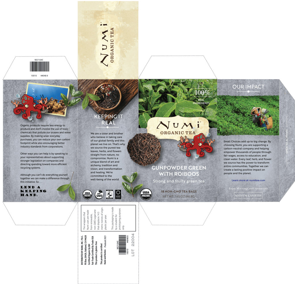

Whether you need a brand identity that expresses your values, a crowd-pleasing poster design, or a show-stopping logo, You’ve found the right place.
